Brand Sheet
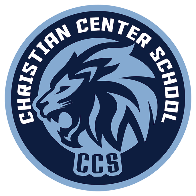
The Christian Center School logo is a key part of our school’s identity. It represents our values, our community, and our commitment to Christian education. To preserve the integrity of the CCS brand, the following guidelines define proper and improper uses of the logos, themes and project brands.
Logo Usage Guidelines
-
Colors
Use only the official CCS colors:
Blue (Primary) #0e1d40
White (Secondary) #85aad1
Black or grayscale versions are permitted if color is not an option.
Backgrounds
Use the logo on clean, solid backgrounds.
Ensure there is enough contrast for visibility (e.g., white logo on dark blue background, blue logo on white background).
Sizing
Scale the logo proportionally; maintain the original aspect ratio.
Minimum size: Logo must remain legible and clear at small sizes (no smaller than 1” wide for print, 100px wide for digital use).
Clear Space
Keep a clear space around the logo equal to at least the height of the “C” in CCS.
No text, graphics, or images should intrude into this area.
Formats
Use only approved digital files (PNG, JPG, SVG, EPS).
For print, use high-resolution files. For web, use optimized web versions.
-
Do not:
Alter Colors – Avoid using unapproved colors (e.g., red, green, neon variations).
Stretch or Distort – Do not stretch, squash, tilt, or rotate the logo.
Add Effects – Avoid drop shadows, outlines, gradients, glows, or 3D effects.
Change Proportions – Do not crop, rearrange, or change the elements of the logo.
Use Busy Backgrounds – Do not place the logo on patterned, textured, or low-contrast backgrounds that make it unreadable.
Add Words or Graphics – Do not combine the logo with other icons, mascots, or clipart without approval.
Change Fonts – Do not replace or modify the official typeface within the logo.
Use Old Versions – Only use the most current, approved logo provided by CCS.
-
When the logo always looks the same, it reinforces our mission: Christ-centered education that equips students to serve and lead. A scattered or altered logo weakens that message.
We Create Recognition
Just like the cross, a sports team emblem, or a company brand, repetition builds familiarity. The more consistently people see the CCS logo, the quicker they connect it to our school and our students.We Honor Our Identity
The logo represents not just an image, but the story of CCS. It stands for our faith, our students, our history, and our legacy. Protecting it ensures we present ourselves with excellence in everything we do.
In short, using the CCS logo correctly isn’t about rules for rules’ sake — it’s about stewarding our identity, protecting our reputation, and keeping the focus on what truly matters: glorifying God through Christian education.
-
Examples
✅ Correct
Blue CCS logo on a white background.
White CCS logo on a blue banner.
Logo placed in the footer of a letterhead with proper spacing.
❌ Incorrect
CCS logo in rainbow colors.
CCS logo stretched to fit a box.
CCS logo placed on top of a busy photo.
CCS logo with “Go Lions!” typed across it.
CCS Logo with Spiderman replacing the Lion
Brand Sheet Downloads (Best for Print)
Christian Center School | PDF
Legacy Project | PDF
Agape Theme | PDF
Downloads
Christian Center School
“Verdana Regular” and “Verdana Bold” | Color: Primary: #0e1d40 and Secondary: #85aad1


